

More and more people are using smartphones and tablets every day. This changes the context for web browsers and how they will function once installed on the devices. Mobile device browsers have surpassed desktop browsers as the primary way of accessing websites. Mobile phones are a convenient technological advancement that is intelligent, compact, and simple to operate.

Let’s start with an eye-opening stat:
Mobile accounts for approximately half of the web traffic worldwide. In the second quarter of 2022, mobile devices (excluding tablets) generated 58.99 percent of global website traffic, consistently hovering around the 50 percent mark since the beginning of 2017 before permanently surpassing it in 2020.
So, it is not a secret that WordPress websites optimized for mobile devices are the new standard. However, building an eye-catching and responsive site may be a daunting task. This blog post will explain why having a mobile-friendly website is essential. We will also show you how to design a mobile-friendly website using WordPress.
What is the Importance of Having a Mobile-Friendly Website?
As per the report:
In the fourth quarter of 2021, it was found that 29 percent of paid Microsoft Advertising (formerly known as Bing) search clicks originated from mobile devices, with four percent of total clicks being generated via tablet devices. In contrast, 73 percent of search ad clicks on Google were via mobile.
This implies that more than half of people choose smartphones and tablets over traditional desktop computers. So, to keep up with your customers, your website must be optimized for every screen size. Your users will have a better user experience and can seamlessly discover what they need while on the go.
What is Responsive Design?
No matter if it’s a tablet, desktop, smartphone, laptop, or even a smart TV, responsive design describes a modern approach to web design that makes it possible for WordPress sites to be shown on different screen sizes and devices by automatically adapting to the given screen!
Responsive design enables webmasters to construct “flexible” websites that adapt to the user and device in a world where users constantly switch between various devices. Flexible grid layouts, adaptive images, and CSS media queries are used to achieve this.
Relative units, or percentages, are used in flexible grid layouts as opposed to fixed units like pixels. Media queries look at the device a website is being viewed on to figure out the best way to show it.
Does WordPress optimize for mobile?
Given the widespread availability of responsive WordPress themes, the default response will be “yes.” It’s crucial to give your users a great experience on any device they are using, whether your site is being developed or is up for a redesign.
Here are different ways WordPress optimizes for mobile:
- Better image quality via image optimization plugins
- Better responsive themes for mobile
- Avoids Pop-up windows
- Uses white spaces
How do I make my website mobile-friendly?
1- Choose an Appropriate WordPress Theme for Mobile Devices
By selecting a mobile-friendly theme, you may provide your customers with a consistent web presence across various screens and resolutions. To enhance user functionality on your mobile website, pick a compatible theme with a responsive layout tag.
Check both the WordPress and theme versions again. Start with any pending updates. Certain updates will sometimes have mobile-friendly features and may be sufficient to solve your issues. For instance, WordPress 4.4 offers some interesting responsive image functionality.
If upgrades are ineffective, it may be time to find a new WordPress responsive theme or think about developing your own.
2- Perform a Mobile-Friendliness Test
Your WordPress site might look fantastic on one mobile device (e.g., your smartphone), but you should test it on different screen sizes to determine whether it is genuinely responsive or not. It can take a lot of time to test it on every screen, even if you have a ton of outdated phones hanging around.
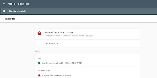
Google has provided us with a free mobile-friendly testing tool to make things easier. The tool will let you know whether or not your WordPress website is considered “mobile-friendly.” For a fast evaluation of your site’s mobile design, enter the URL of your site. If your site is fully optimized for mobile devices, you’ll get a happy message telling you so.
3- Install and Activate Right WordPress Plugin
There is a range of plugins readily available on WordPress. Even though there are a lot of plugins available, it’s important to choose the one that will help your WordPress site work well on all devices.
For instance, adding a sidebar widget to a desktop website is fantastic. However, if it dominates the mobile design or doesn’t scale down, the user experience won’t be seamless.
Similar to themes, consider the plugin features and obtain a demo or read reviews before installing one. After activating a new plugin on your WordPress site, make sure to do a quick quality check to make sure it fits all screen sizes.
4- Upload Content That is Compatible with Every Mobile Device
Making sure your material is appropriately structured can make it mobile-friendly. Your original material must be easily navigable and available on the entire device. The following are some methods for producing content that is appropriate for mobile devices:
- Enhance the text size
- A lot of unused space
- Concise headers that are also comprehensible
- Divide the website text into subsections
- Keep important details at the top of your website pages
5- Keep Irritating Pop Ups Away from Mobile Devices
It’s mandatory to have a range of opt-ins if you have a WordPress site and want to develop an email list. On most mobile devices, email opt-in forms function perfectly (assuming they scale and are easy to use).
However, pop-ups are distinct categories. Google penalizes WordPress popups with flash animations, often known as opt-ins, that cover a website’s content. This covers pop-ups (whether they appear immediately or after a while) and any other type of opt-in that a user needs to dismiss before accessing the content on the page.
So, keep your WordPress site mobile-friendly by following the best practices and avoiding pop-ups on mobile design.
6- Take Advantage of Accelerated Mobile Pages
Google started the open-source project Accelerated Mobile Pages to provide quick-loading content for mobile devices. Publishers may now create content that is mobile-friendly just once, and it will load instantly on every mobile webpage.
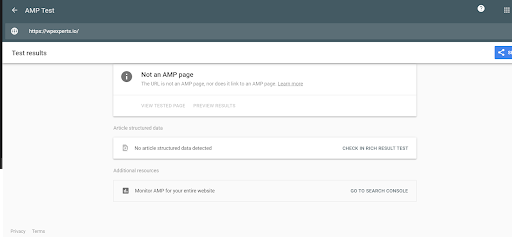
Actually, AMP consists of numerous universal website enhancements that have been implemented following Google’s guidelines. There will be a standard assortment of advertising forms, networks, and technological choices. Companies can also choose any format they want, as long as it doesn’t slow down the workflow.
How Do I Manage My WordPress Site on Mobile?
1- Enable Off-site Publishing
WordPress regularly uses ‘XML-RPC functionality. This functionality enables remote publishing, while WordPress turns it off automatically by default.
Head to Settings, Writing, and Remote Publishing to activate remote publishing. Lastly, checkmark the box.
2- Download the App
For apple devices, download WordPress from iOS; otherwise, use the app store.
You can use different applications, too, like Windows Phone 7, Blackberry, WebOS, and Nokia!
3- Configure
Open the application, and you’ll be prompted to configure the application – select ‘Add self-hosted WordPress blog.’
Now all you need is to enter the following:
- Your website’s URL
- User ID (you typically use for your WordPress site)
- Password
4- What you can do.
Through the WordPress app, you can:
- Make and edit page posts and content
- Insert images
- Edit, moderate, or reply
- moderate comments in bulk
- Spell check
- Share Geotags on the iPhone
You now have the means to update your WP website whether traveling by bus, rail, or even at work or home. Mobile updates let you “live blog” in real-time, allowing you to provide short updates even from the kitchen of a busy cafe or restaurant.
Wrap Up
Google now encourages website usage that is responsive to mobile devices and works on all platforms. As a result, if your company website is not responsive to mobile devices, you fall behind the competition and drop Google rankings. The professionals at our WordPress development company think the advice mentioned above will help you make your WordPress site mobile-friendly.
FAQs
Why does my WordPress site look bad on mobile?
Fonts, buttons, etc.—everything looks small in mobile browsers. Also, mobile browsers carry less bandwidth compared to desktop browsers. Moreover, they carry less memory compared to their desktop counterparts. And lastly, mobile browsers are, by default, designed for short visits. All these factors combined make WordPress’s site look bad on mobile.
Does WordPress have a mobile editor?
Yes, it does. To see the mobile preview, log in to your WordPress website. Click “WordPress Theme Customizer” by following the path:
WP dashboard > Appearance > Customize.
Can you convert a WordPress website into a mobile app for free?
Yes! You can convert a WordPress site into a mobile app. There is a seamless option to do so in the shape of APPExperts. APPExperts is a WordPress plugin that helps you convert WP sites into Android and iOS mobile apps.
What’s the most frustrating thing about WordPress?
The most aggravating aspect of WordPress is its updating system; whenever you update or add something new to your site, something almost always breaks. You must be cautious with all these (many and regular!) updates, which is highly irritating.


