A user-friendly interface enables users to understand and navigate the website effortlessly. If you want to keep users on your website, take care of the end-user experience from the start of the design process.
Since WordPress powers 35% of the web, you need to ensure you are providing 100% user-friendliness.
The user experience of your website immediately affects how visitors interact with it. It also significantly impacts whether or not they will stay long enough to convert. Our WordPress development company for Enterprises has come up with a few ideas that you can use to ensure the user experience is at the forefront of your web development processes.
What Makes a Design User-Friendly
– Quick page loading
One of the main reasons people abandon a website without engaging is that it takes too long to load. Consumers are used to receiving information immediately. They would visit rival websites if yours took too long to load.
– Simple to navigate
Information should be easy to find for users and search engines. The page’s design must be simple to understand and not conceal facts.
– Available for all gadgets and users
Most people in the world use their mobile phones to access the internet.
One in four Americans has a disability of some kind. A website is user-friendly if it follows accessibility standards and can be used by anyone on any device.
What Happens If a Website Is Not User-Friendly
– User Experience Becomes Complicated
For your visitors to quickly understand your website, both the design and the content should be easy to grasp. Users often take less than 3 seconds to comprehend a web page. Too many buttons, photos, or other items on your page make it difficult for visitors to understand everything quickly.
– Your WordPress Site Becomes Inaccessible
Accessibility is essential for any website. Therefore, WCAG standards have been created so website developers can ensure user-friendliness. There are several ways to make your website more accessible to people with disabilities, such as adding alternate text to images, adding subtitles to videos, and using a straightforward web design.
– Website Becomes Non-Intuitive
Building your website in a way that makes sense to your visitors is essential. It becomes difficult for users to navigate through too many navigational items or see page names that are unclear. Website structure is vital for all websites, but is significant for e-commerce companies.
Tips to Make a WordPress Site User-friendly
1- Pick a Design That You Can Scale
An essential component of user-friendliness is acknowledging that users will access your site from several devices. A responsive theme will provide the solution to this issue. This makes sure that the website will look right on desktop computers, tablets, and phones.
Also, the size of the buttons will be appropriate for the device being used to view it, and the navigational elements will always be easily accessible above the fold. Images are scaled to fit the available screen. Our WordPress company recommends that you focus on responsive design to make your site as easy to use as possible.
2- Increase Website Speed
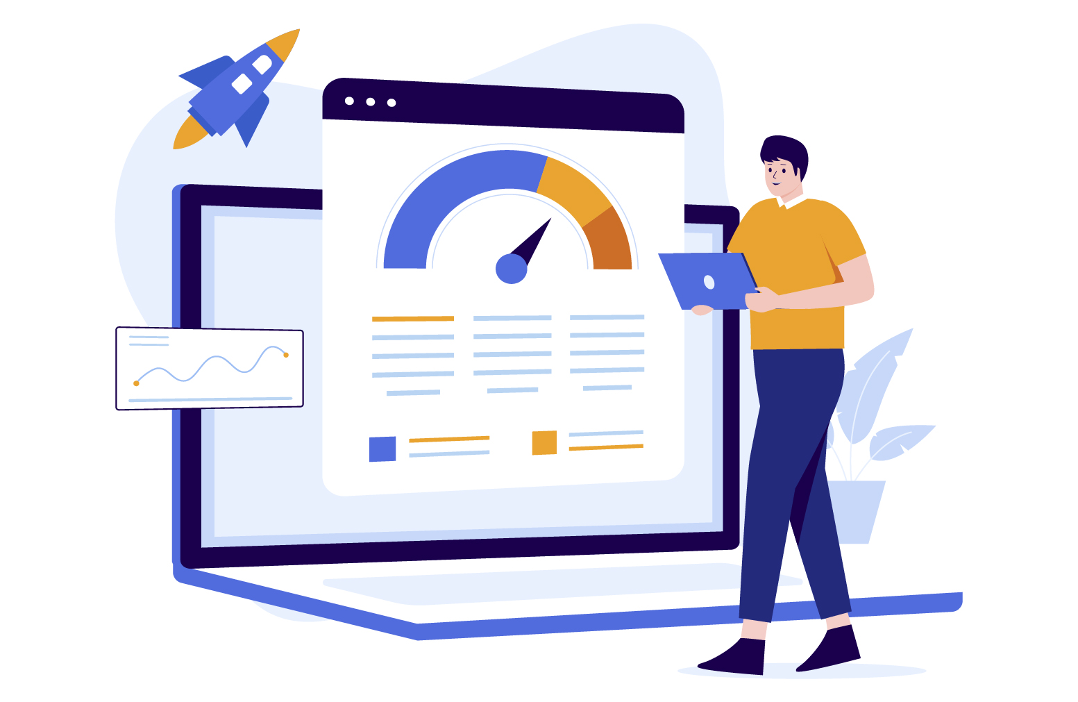
The speed at which your website’s pages load can also impact how user-friendly it is overall. For instance, if a website loads slowly but the user already knows how to get there, the visitor will likely grow increasingly irritated while waiting. So, exercise common sense. If you need to, you can use software to compress your photos, or you can try not to use images that are too big.
3- Use Colors That Complement Each Other
Be cautious when selecting color combinations for your template while creating a website! Your website’s color scheme could be one of two things: either it contains TOO MUCH color, or its colors are too simple.
Choose the right colors – When selecting the most eye-catching colors for your user-friendly website, you can opt for color schemes with complementary accent colors or patterns with analogous colors. When you make your logo with a logo maker, consider keeping the consistency in colors and design. An animated logo adds motion to a brand’s emblem, enhancing its appeal and memorability with dynamic visual effects.
Consider the reader’s color inadequacies when selecting your colors, such as the red-green color deficiency. Make sure to offer visual clues to identify one piece of content from another so you can think about their issues.
4- Make Sure You Write Efficiently
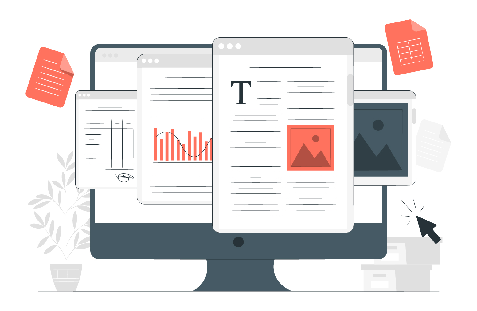
People enjoy reading articles from different websites, so they look for well-written and visually appealing ones. If you intend to upload something, be sure to take into account these recommendations for a user-friendly website design:
- Make room for spaces:
Ensure sufficient white space separates the paragraphs and photos in your articles. Your audience will be better able to comprehend and take in your posting if you do it this way. Who would want to read a piece of writing with that many photos and text?
- Choose appropriate fonts:
The importance of a font for your web pages should not be underestimated. Make sure the fonts you use are not too fancy or tiny. Remember that some users might utilize their personal computers or mobile devices to browse your user-friendly website. As a result, a typeface that is accessible on personal computers could not be readable on smartphones. Pick a font that is simple to read!
- Make an impactful header and title:
Your article’s headings and titles need to pique your audience’s interest. Just by reading your title and introduction, they should be interested in the entire article’s content. After all, writing in straightforward language may make it challenging to keep readers’ attention.
5- Make Navigation Seamless
A WordPress site’s navigation should be easy to find and use. For that reason, you shouldn’t try to handle menus creatively. Using drop-downs that lead to further drop-downs won’t get you any leads.
If your menus are concealed, visitors will have to search harder to find your content. This is a task you should avoid. Instead, place the menus in a prominent location, frequently at the top or left of the page. Moreover, make sure your website has a user-friendly search box. It should not be harder than necessary for your visitors to find the information they need.
6- Increase the Site’s Responsiveness
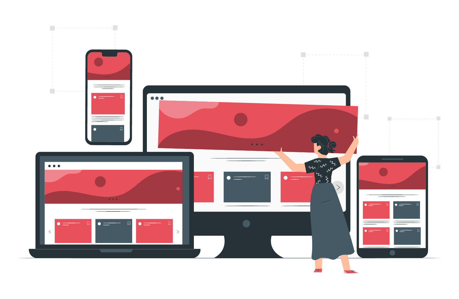
WordPress has done a tremendous job, and it is evolving as a CMS platform to resolve the needs of site owners efficiently and coherently. For example, WordPress Version 4.4 has addressed the significant issue of resolving limitations due to images occurring on various mobile devices by default.
Moreover, issues like restricted bandwidth, metered connections, etc., are managed automatically because WordPress allows loading the smallest media file version (e.g., an image) on the server. Therefore, keeping the WordPress website updated can help massively.
However, this does not mean you lessen your users’ cognitive strain while loading web pages and skimming content. Ensure your website’s UI (user interface) and design are responsive to various circumstances. Finally, it should be noted that you can take things up a notch by using the WordPress accessibility plugin.
What Should You Avoid on Your Website
– Poor Web Design
This is a visual world we are living in. Thus, your potential clients will be turned off in no time if your website has a terrible user experience or looks too generic. Furthermore, if your website is difficult to navigate, customers will quickly leave and go to your competitors.

– Broken Links
Make every effort to eliminate broken links or links that don’t belong on any particular page or website content. By retaining these links, you are demonstrating to your users that you do not care about their online experience.

Is There Any One-stop-shop Solution to have a User-Friendly Website
If you need to make or improve your WordPress site’s user-friendliness, a dedicated WordPress development agency like WPExperts is the need of the hour...

WPExperts is a market-leading “360 degree” WordPress development company focusing on full-stack development for WordPress, Magento, WooCommerce, and Shopify. They have more than ten years of experience with the WordPress & WooCommerce platforms and have acquired more than 500 clients globally.
Wrap Up
Many of the above recommendations are best practices, regardless of the platform on which you design your site. However, WordPress makes building a more user-friendly site easier because of some built-in features and the flexibility to add more through plugins. Additionally, providing a user-friendly experience might continuously lead to referrals and repeat buyers.
FAQs
Is Wix user-friendly?
Wix is a user-friendly platform that is simple, even if you have never built a website. One of the most accessible web editors to use on the market is its drag-and-drop editor.
Is HTML user-friendly?
Yes, HTML is among the user-friendly languages, as you need no prior knowledge.
What do customers look for in a website?
Customers who browse websites seek simple navigation, appealing design, and informational content.
What is the most important part of a website?
Content! Your website is far more important than a simple advertisement. So, making it ineffective for online marketing is a bad idea.


